


Glass, Gradient, and Clarity: A Study in Minimalist Futurism
- Nano Banana
- Seedream 4.0
Minimalist futurism in visual design emphasizes restraint, precision, and light as a material. Its roots lie in Swiss typography and digital materiality, evolving into a language of refinement often used in luxury branding and conceptual advertising.
This prompt—featuring Coca-Cola’s iconic bottle—requires balancing brand familiarity with modern abstraction. Both AI systems must navigate a design philosophy that values less as more, using lighting, texture, and spacing as narrative devices rather than overt visual clutter.
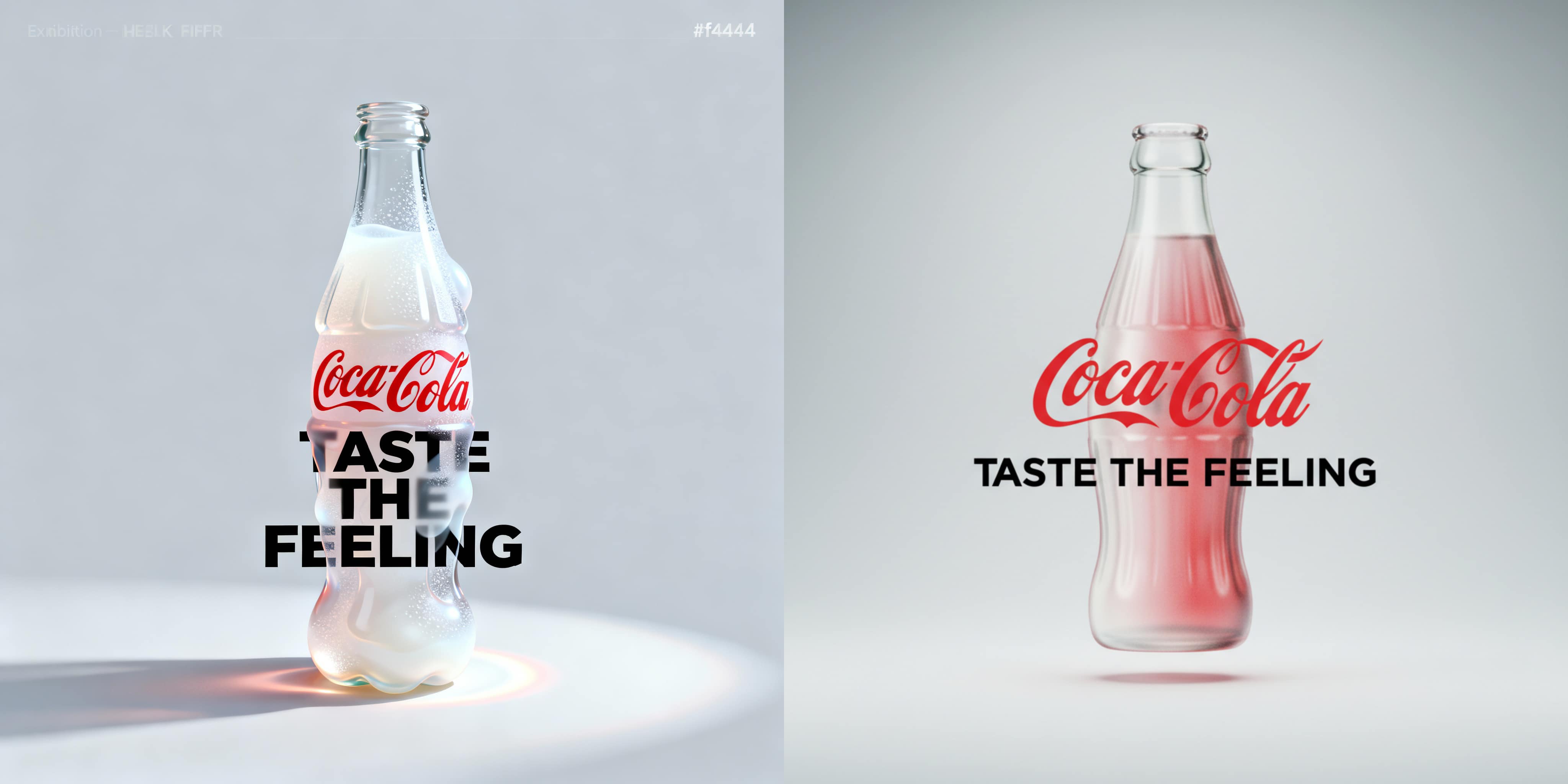
Prompt: A vertical (3:4) 4K-resolution minimalist futurist exhibition poster with an ultra-light cool gray background (#f4f4f4).
At the center of the poster is a fluid 3D metaball shaped like a classic Coca-Cola bottle in full form, rendered in frosted glass with delicate grainy noise.
The fluid gradient transitions from Coca-Cola Red (#E41C23) to Pearl White (#FFFFFF), giving it a silky glass-like appearance.
High-position softbox lighting casts long, soft colored shadows and a subtle halo.
The fluid overlaps with the text: letters obscured by the frosted glass appear with a gentle Gaussian blur.
•The main title, the classic red “Coca-Cola” logo, is centered and partially obscured by the fluid. The covered letters are slightly blurred through the frosted glass.
•The subtitle, in bold all-caps modern sans-serif pure black font, reads: “TASTE THE FEELING”, placed below the main title. It is also partially overlapped by the fluid and blurred in those areas, while the rest remains sharp.
The overall layout is clean with generous whitespace, balanced composition, sharp focus, and HDR high dynamic range.
Results & Observations
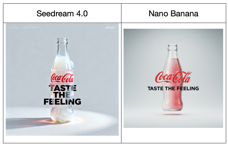
seeDream 4.0 Output
seeDream 4.0 excels in conceptual fidelity and technical discipline. The frosted-glass bottle achieves a nearly liquid realism, with precise gradient control that flows naturally from Coca-Cola Red to luminous pearl tones. The background is restrained and elegant, with a high sense of depth created through diffused lighting and long, feathered shadows.
Typography integration is masterful—the blurred overlay through the glass maintains optical consistency, simulating light diffusion as text passes behind a translucent medium. The balance of white space, soft contrast, and HDR-style highlight bloom gives the poster an almost museum-grade sophistication. The overall impression aligns with the language of Apple design advertising—clean, emotionally detached, yet visually magnetic.
Nano Banana Output
Nano Banana’s version interprets the brief with warmth and narrative focus. The glass texture is smoother and less noisy, producing a more polished aesthetic. The red hue of the fluid interior carries a slightly nostalgic tone, evoking early Coca-Cola ads rather than pure futurism. The composition centers the bottle clearly, but the typography—while correct in placement—lacks the optical realism of frosted diffusion.
Its simplicity works well from a product-advertising standpoint but misses the deeper experimental minimalism of seeDream’s output. Where seeDream feels like a gallery poster, Nano Banana’s feels like an elegant brand ad—accessible, clean, but less conceptual.
Conclusion
Both interpretations successfully manifest the spirit of minimalist futurism but diverge in intent and tone:
- seeDream 4.0 elevates the brief into visual art, emphasizing translucency, realism, and the tactile language of light. Its result embodies restrained perfectionism suited for conceptual exhibitions or design showcases.
- Nano Banana, by contrast, delivers a warmer, brand-focused execution. It communicates product clarity and emotional familiarity, making it more effective in commercial contexts than in experimental ones.
Satirical Cartoon Generation
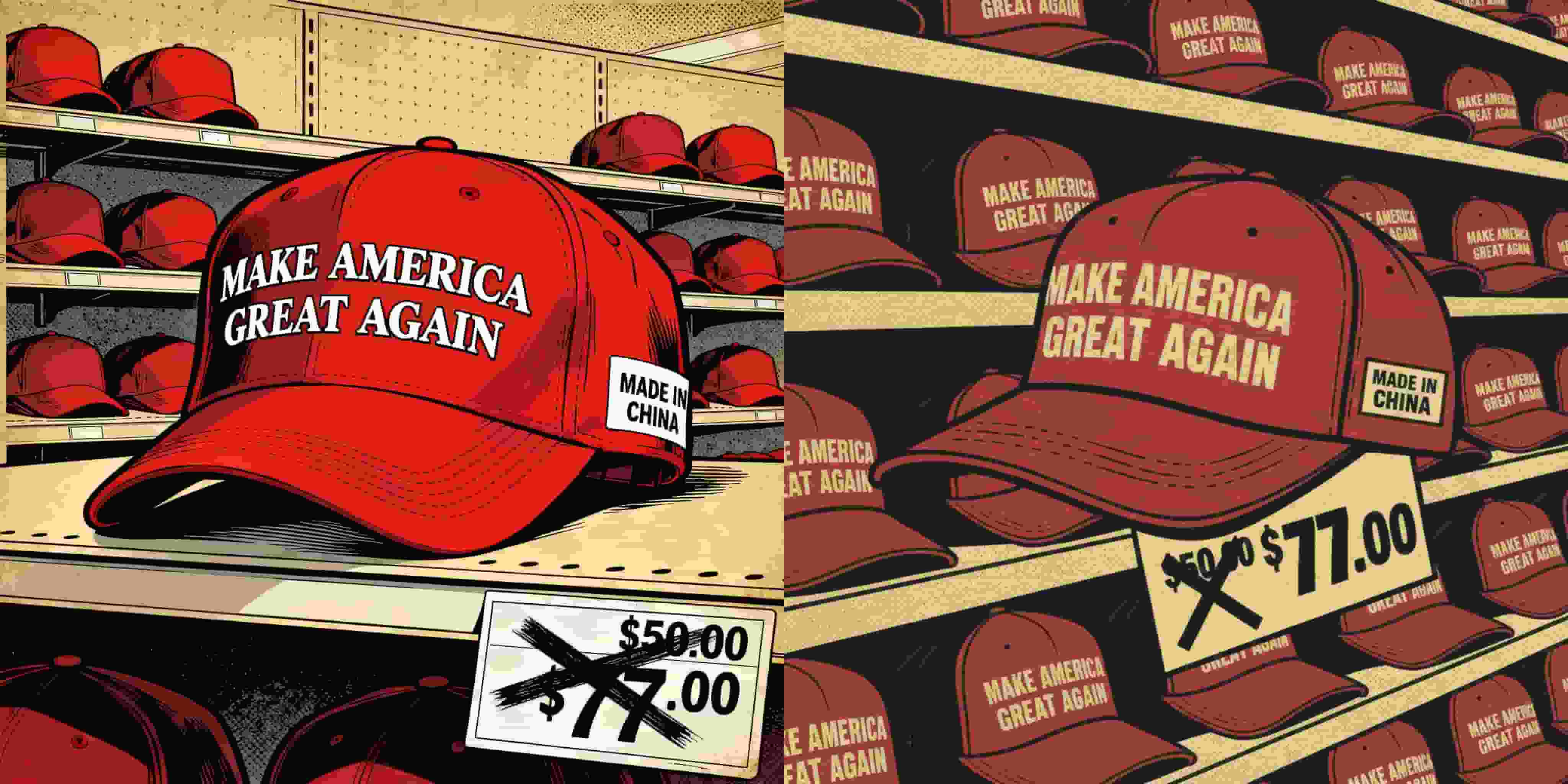
This comparison investigates how seeDream 4.0 and Nano Banana handle a politically charged, satirical illustration prompt. The task involves emulating the vintage American comic-book style to critique political consumerism through the ironic juxtaposition of a “MAKE AMERICA GREAT AGAIN” hat labeled “MADE IN CHINA.” The challenge lies in achieving the right balance between visual humor, retro stylization, and conceptual bite—capturing the tension between patriotism and production irony through both design and tone.
By Jocelyn 一 Oct 08, 2025- Nano Banana
- Seedream 4.0
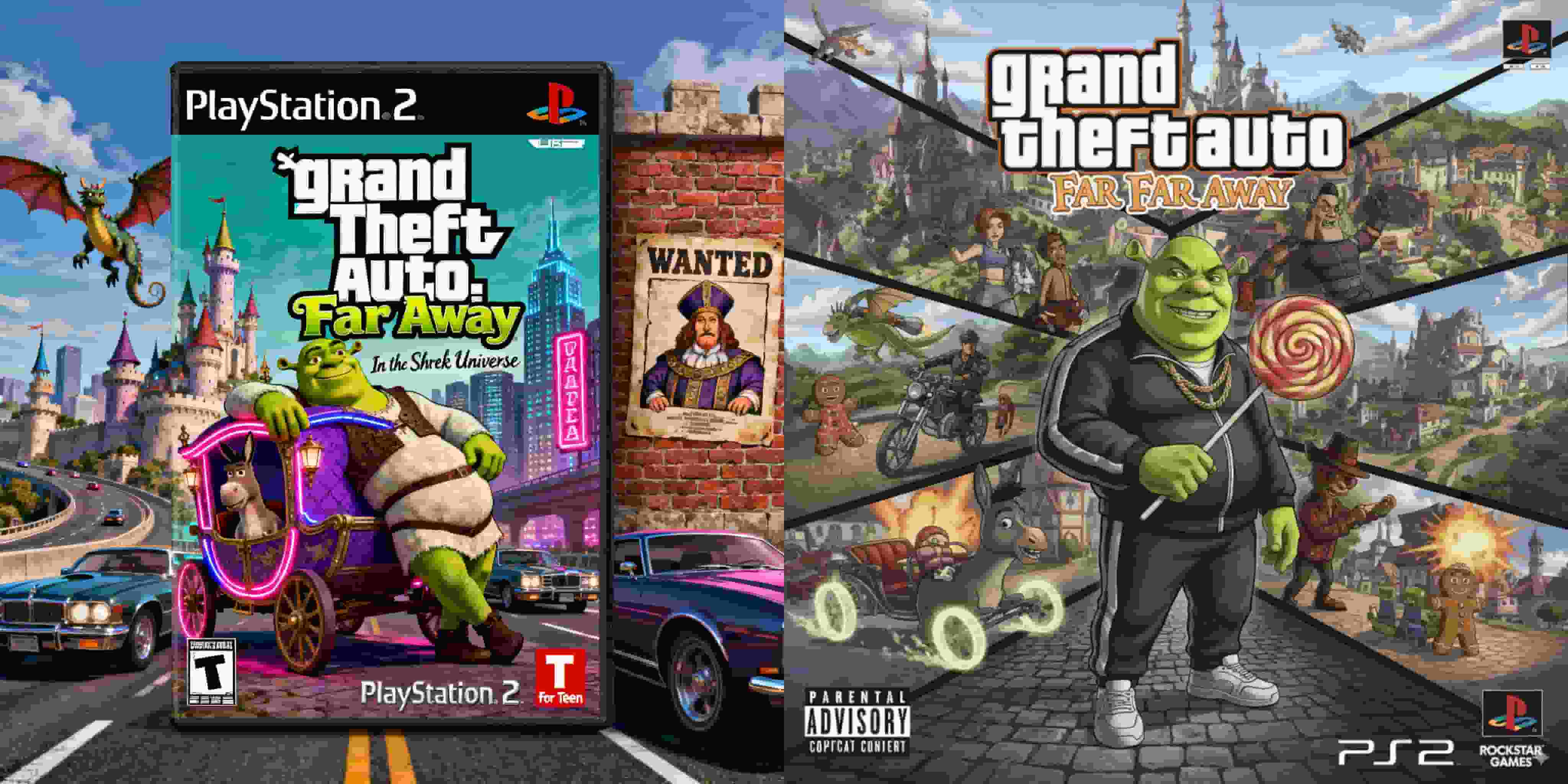
PS2 Game Cover — “Grand Theft Auto: Far Far Away”
This comparative analysis explores how seeDream 4.0 and Nano Banana reinterpret the concept of a PlayStation 2 game cover that merges the crime-driven chaos of Grand Theft Auto with the whimsical fairy-tale world of Shrek. The goal is to examine how each model balances satire, nostalgia, and design coherence while maintaining the aesthetics of early-2000s game packaging. The challenge lies in combining two vastly different visual languages — Rockstar Games’ gritty realism and DreamWorks’ cartoon fantasy — into a single, believable artifact of pop-cultural parody.
By Jocelyn 一 Oct 08, 2025- Nano Banana
- Seedream 4.0
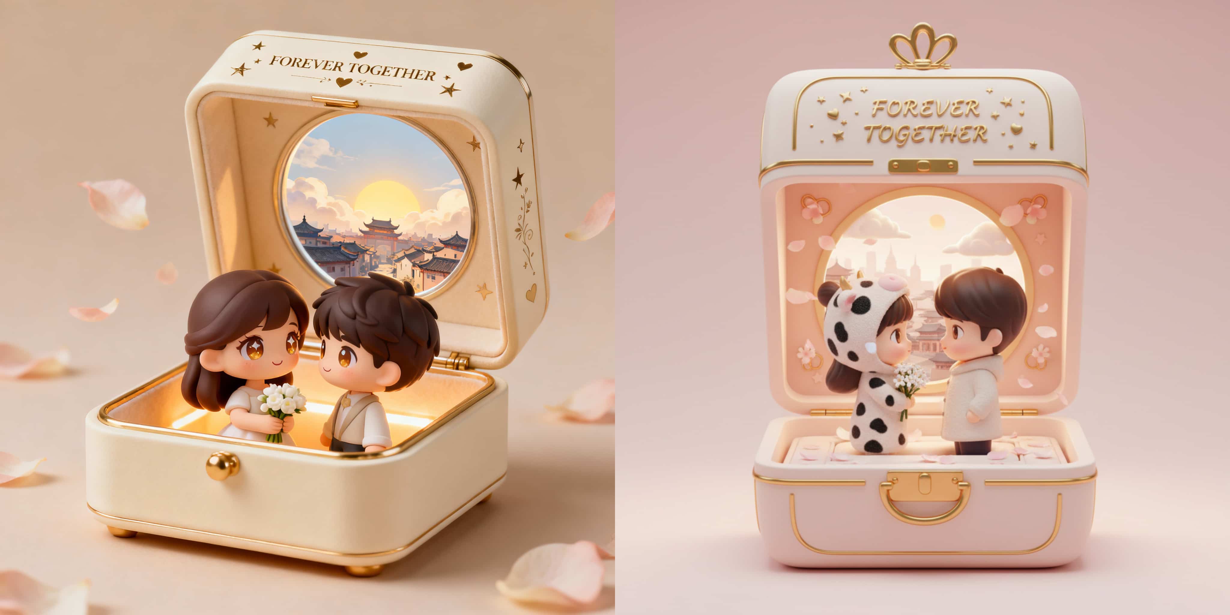
3D Couple Jewelry Box Figurine
This comparative study explores how seeDream 4.0 and Nano Banana interpret a romantic 3D collectible prompt that blends miniature craftsmanship, emotional storytelling, and luxury design sensibility. The goal is to produce a heartwarming diorama—a jewelry box that opens to reveal two chibi-style lovers rendered in a soft, pastel-toned environment. Both systems are tested for their ability to balance realism, sentimentality, and material detail while maintaining visual harmony within the confined space of a jewelry box.
By Jocelyn 一 Oct 08, 2025- Nano Banana
- Seedream 4.0
- X
- Youtube
- Discord