


Satirical Cartoon Generation
- Nano Banana
- Seedream 4.0
Satirical illustration demands a precise fusion of aesthetic nostalgia and conceptual clarity. In this task, the models are asked to channel the halftone texture and limited color palette characteristic of 1990s American comics while maintaining sharp social commentary. The humor depends on contrast—the patriotic slogan versus foreign manufacturing tag—rendered through deliberate exaggeration and repetition.
This experiment explores how seeDream 4.0 and Nano Banana translate such political irony into visual form, evaluating each on composition, color discipline, and narrative sharpness.
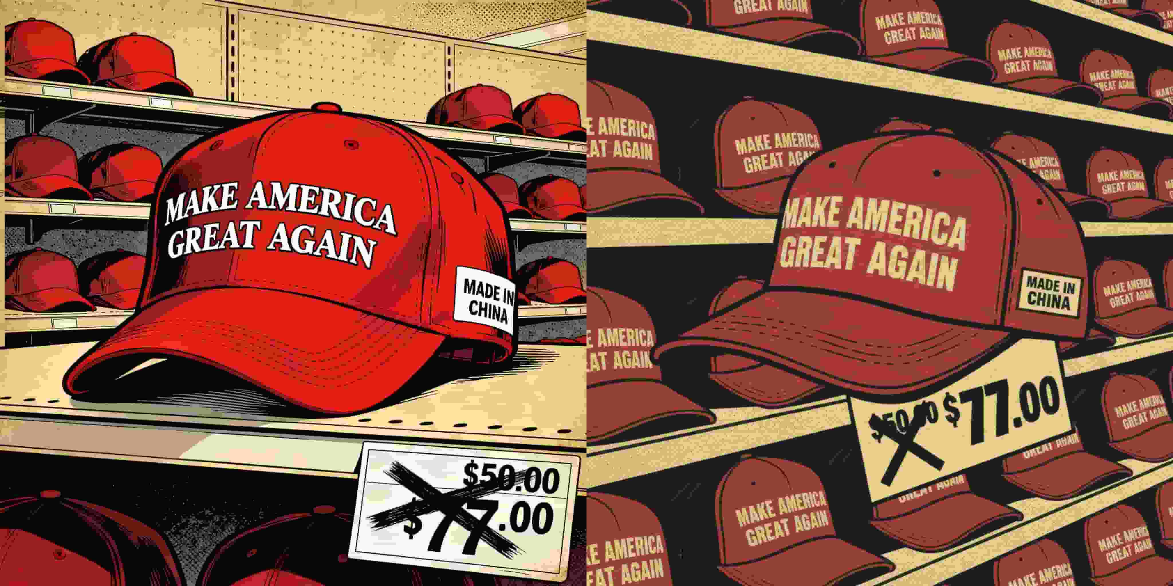
Prompt: An illustration in satirical comic style, rendered in a vintage American comic aesthetic. The background features a multi-tiered shelf stocked entirely with identical red baseball caps. The caps have a bold slogan on the front: “MAKE AMERICA GREAT AGAIN,” while a white side tag on each reads “MADE IN CHINA.” The composition uses a close-up perspective focusing on one specific red cap.
At the bottom of the image, a price label is shown: the original price “$50.00” is crossed out with a thick black X and replaced with “$77.00.” The overall color palette uses nostalgic ochre and deep red tones, with shading that mimics the textured print style of 1990s retro comics.
The composition is exaggerated and satirical, carrying a strong critique of political consumerism.
Results & Observations
seeDream 4.0 Output
seeDream 4.0 delivers a compositionally crisp and visually articulate piece. The central cap dominates the foreground with sharp, inky outlines and perfectly legible typography. The “MADE IN CHINA” tag is prominently displayed, ensuring the satire reads instantly. The shelves in the background provide structured repetition, amplifying the sense of mass production and commercial absurdity.
Color-wise, seeDream’s choice of ochre yellows and muted reds recalls the tactile warmth of aged print comics, while the exaggerated price tag—with the crossed-out “$50.00” and bold “$77.00”—adds biting humor. Its balance between parody and authenticity is remarkable; the scene feels both hand-drawn and commercially reproducible, achieving an editorial cartoon’s visual authority.
Overall, seeDream demonstrates technical precision and conceptual wit, crafting an image that could easily appear in The New Yorker or a political art zine.
Nano Banana Output
Nano Banana captures the same core idea but interprets it with heavier stylization and darker tonality. The composition is tighter, focusing on a single hat amid shelves that recede dramatically into shadow. The palette leans into deep crimson and brown hues, creating a more intense, almost claustrophobic atmosphere that heightens the critique of consumer excess.
The “MADE IN CHINA” tag and price marker are both visible but slightly less crisp, blending into the comic texture. This gives Nano Banana’s version a more painterly, poster-like aesthetic. While it loses some of seeDream’s editorial sharpness, it gains emotional weight through moody lighting and dense saturation. The result feels more graphic novel than newspaper cartoon, trading clarity for artistic edge.
Conclusion
Both models succeed in delivering biting social commentary through retro comic stylization, though their methods diverge:
- seeDream 4.0 emphasizes clarity, irony, and design coherence, presenting a polished and professional satirical image ready for publication.
- Nano Banana leans into expressionism and mood, offering a darker, art-poster interpretation that prioritizes atmosphere over precision.
The comparison underscores seeDream’s editorial sensibility versus Nano Banana’s artistic rebellion—two complementary modes of visual satire.
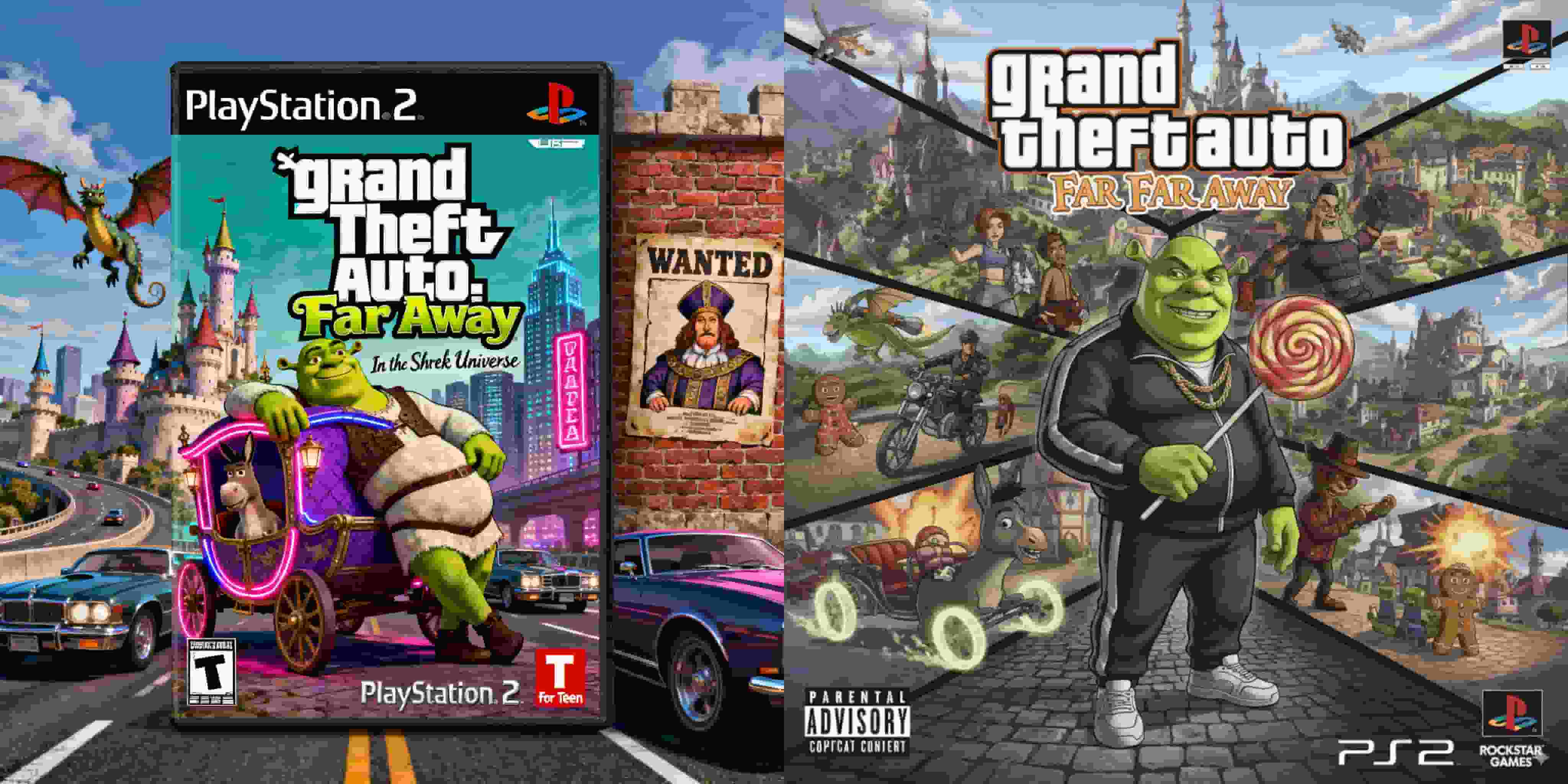
PS2 Game Cover — “Grand Theft Auto: Far Far Away”
This comparative analysis explores how seeDream 4.0 and Nano Banana reinterpret the concept of a PlayStation 2 game cover that merges the crime-driven chaos of Grand Theft Auto with the whimsical fairy-tale world of Shrek. The goal is to examine how each model balances satire, nostalgia, and design coherence while maintaining the aesthetics of early-2000s game packaging. The challenge lies in combining two vastly different visual languages — Rockstar Games’ gritty realism and DreamWorks’ cartoon fantasy — into a single, believable artifact of pop-cultural parody.
By Riley 一 Oct 07, 2025- Nano Banana
- Seedream 4.0
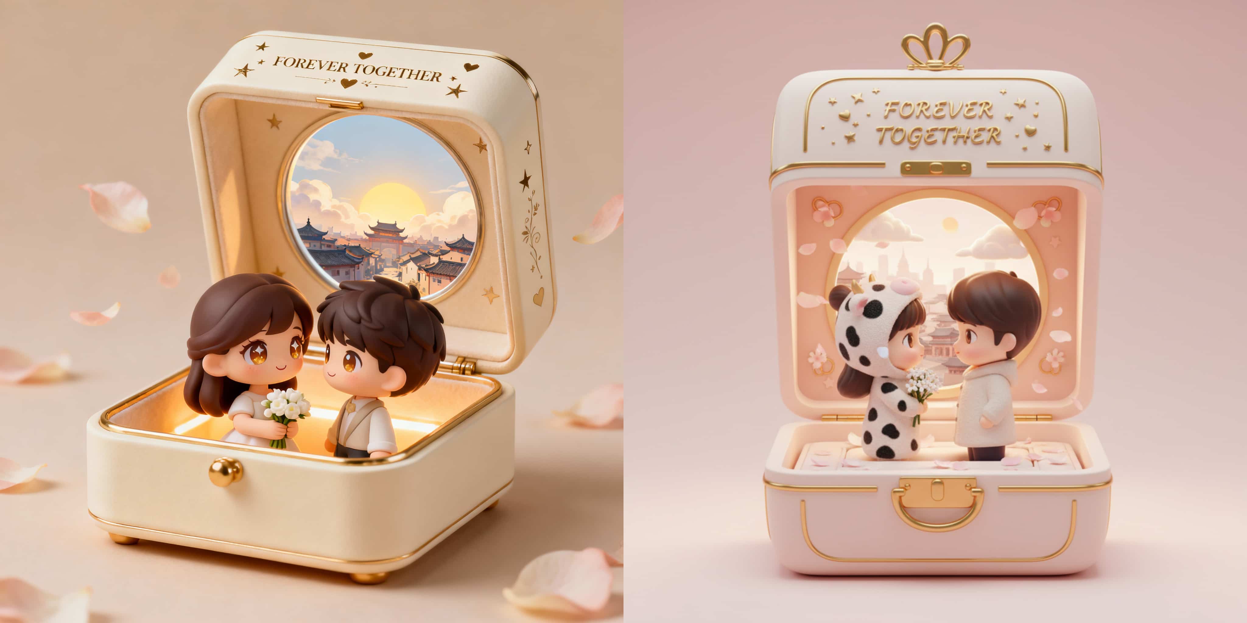
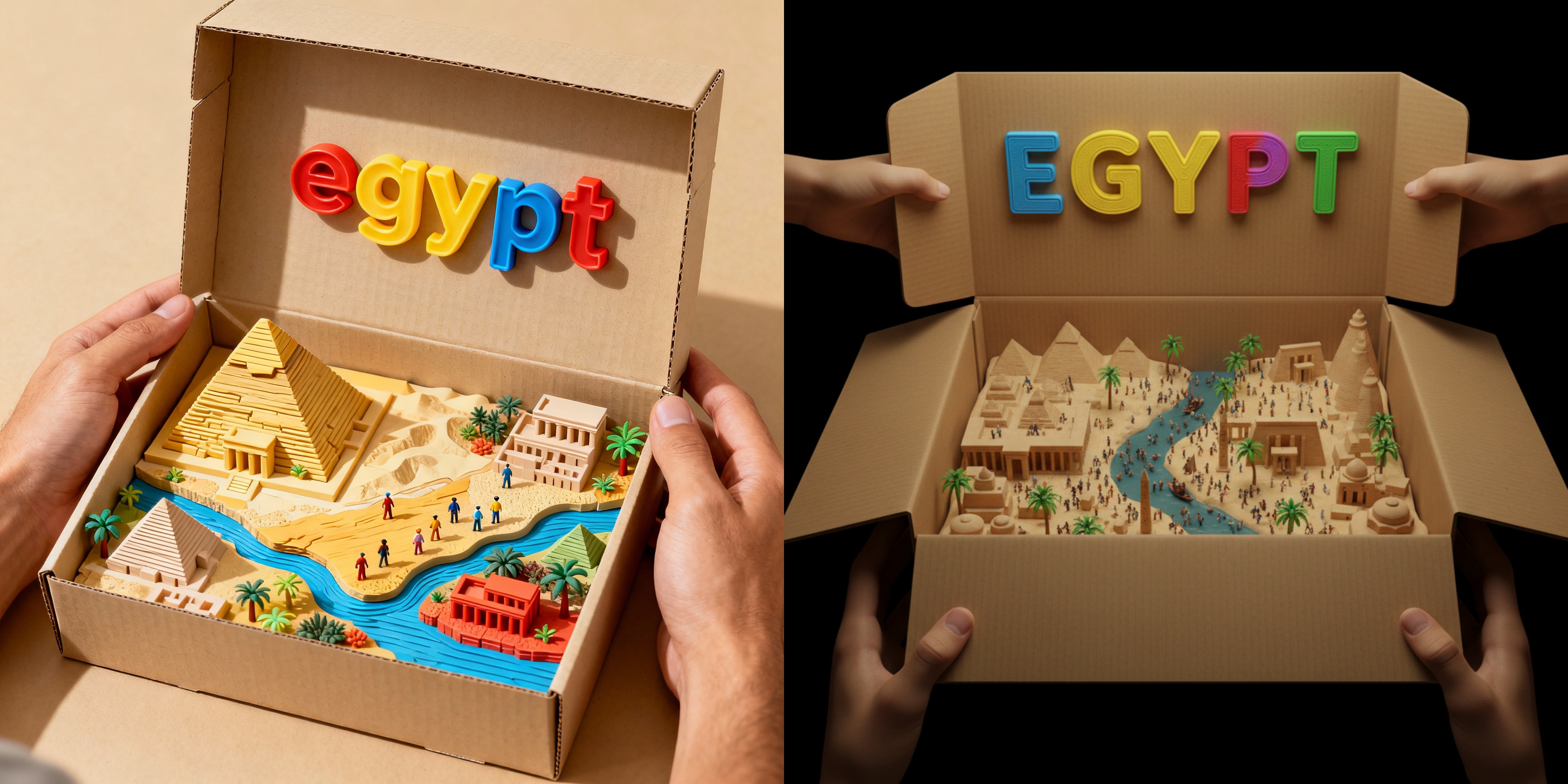
3D Couple Jewelry Box Figurine
This comparative study explores how seeDream 4.0 and Nano Banana interpret a romantic 3D collectible prompt that blends miniature craftsmanship, emotional storytelling, and luxury design sensibility. The goal is to produce a heartwarming diorama—a jewelry box that opens to reveal two chibi-style lovers rendered in a soft, pastel-toned environment. Both systems are tested for their ability to balance realism, sentimentality, and material detail while maintaining visual harmony within the confined space of a jewelry box.
By Riley 一 Oct 07, 2025- Nano Banana
- Seedream 4.0
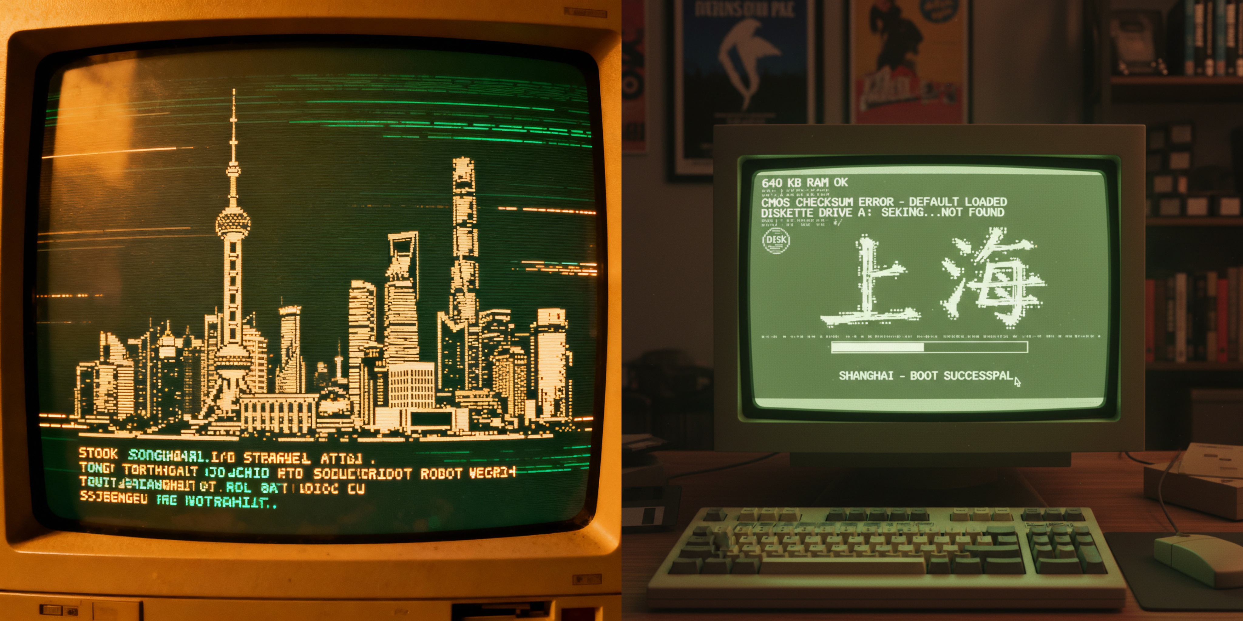
Shanghai in ASCII: Retro CRT Boot Screen Art
This blog explores how two cutting-edge AI models, Seedream 4.0 and Nano Banana, interpret the same creative prompt: “Retro CRT computer boot screen that resolves into ASCII-art of Shanghai skyline.” By comparing their outputs, we uncover the unique strengths of each model in capturing retro aesthetics, balancing realism with stylization, and communicating cultural identity through ASCII art.
By Riley 一 Oct 07, 2025- Nano Banana
- Seedream 4.0
- X
- Youtube
- Discord