PS2 Game Cover — “Grand Theft Auto: Far Far Away”
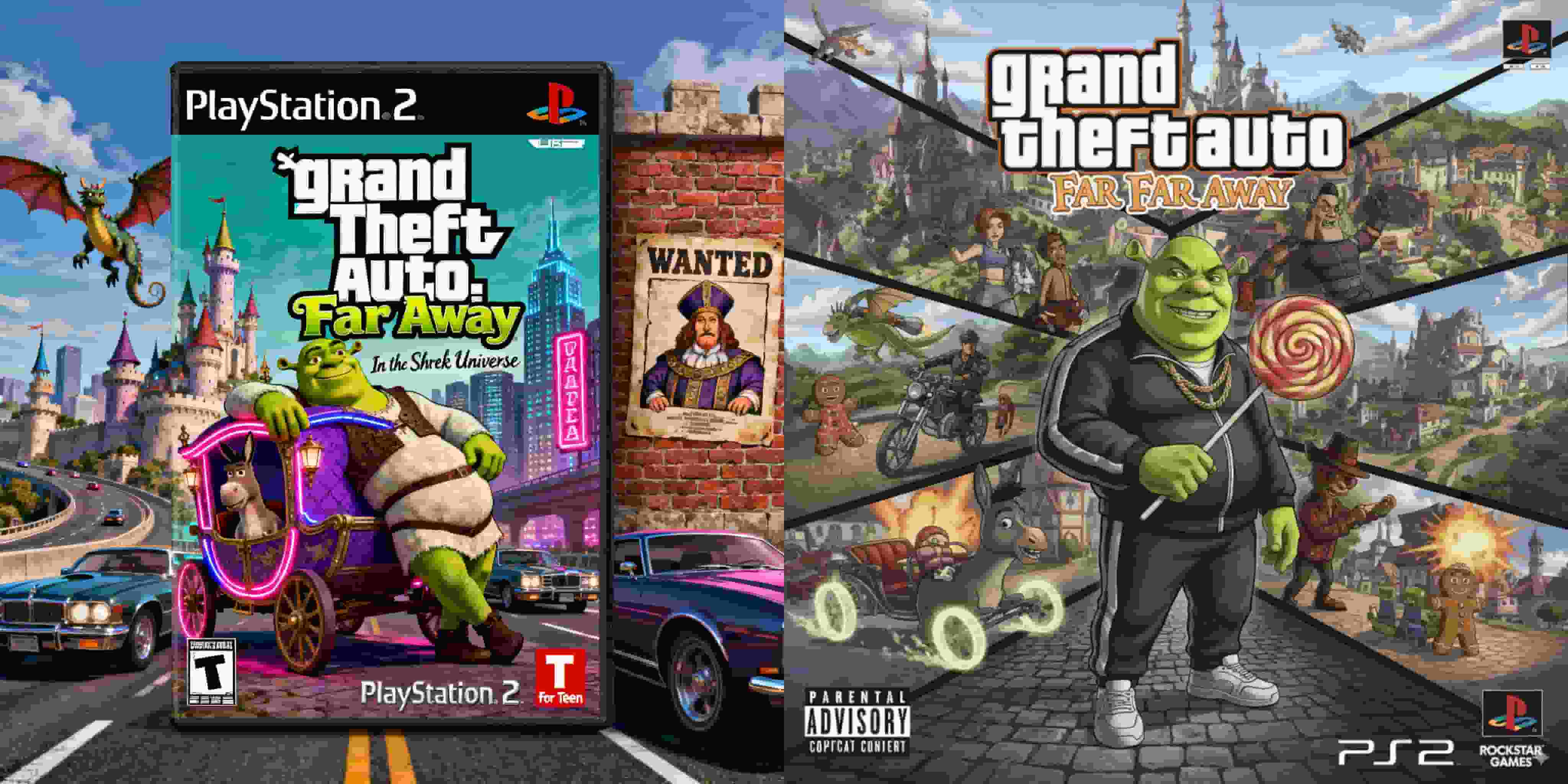
- Nano Banana
- Seedream 4.0
The Grand Theft Auto x Shrek crossover is an ideal prompt for testing visual irony and generative adaptability. A PS2-era cover must not only convey genre hybridity but also emulate the graphic conventions of its time: bold typography, cinematic character placement, and chaotic urban backdrops. This experiment examines how seeDream 4.0 and Nano Banana interpret humor through composition, texture, and typography—revealing their respective strengths in parody realism and conceptual balance.
Prompt: Can you create a PS2 video game case of "Grand Theft Auto: Far Far Away" a GTA based in the Shrek Universe.
Results & Observations
seeDream 4.0 Output
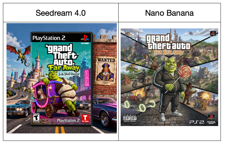
seeDream 4.0 delivers a visually striking and narratively coherent result. The layout adheres closely to authentic PS2-era conventions: a boxed cover featuring the PlayStation logo, ESRB rating, and publisher marks in correct positions. Shrek, positioned front and center, lounges against a medieval-style carriage repurposed as a lowrider, fusing fairy-tale charm with urban satire. The background features a chaotic yet humorous collision of motifs — castle towers, neon signs, and a “Wanted” poster nodding to classic GTA tropes.
The typography of Grand Theft Auto: Far Far Away is faithful to Rockstar’s branding while incorporating a playful color gradient. The visual humor is subtle but layered, and the overall color balance feels polished and commercially ready. seeDream succeeds in preserving the parody realism that defines successful mashups — believable enough to be mistaken for an actual PS2 release.
Nano Banana Output
Nano Banana opts for a collage-style composition with high visual density. The cover features Shrek dressed like a street gangster, gripping a lollipop instead of a weapon — a humorous subversion of GTA’s violence. The split-panel layout resembles a cinematic montage, showing multiple vignettes of action scenes across the “Far Far Away” kingdom. The atmosphere is vibrant, kinetic, and unmistakably cartoonish, capturing the energy of parody rather than its realism.
However, the typography and layout deviate from conventional PS2 cover standards. The Grand Theft Auto logo appears compressed and slightly misaligned, while the PS2 and Rockstar-style emblems are reinterpreted rather than replicated. Nano Banana prioritizes narrative humor and aesthetic exaggeration over period accuracy, producing a composition that feels more like a digital fan poster than a retail-ready game case.
Conclusion
Both models excel at visual humor, yet their strategies differ fundamentally.
- seeDream 4.0 achieves design authenticity through careful adherence to PS2-era structure and tone. Its composition balances parody with commercial plausibility, creating an image that could convincingly appear on an early-2000s game shelf.
- Nano Banana, by contrast, embraces maximalist absurdity. Its approach emphasizes character personality and visual storytelling over graphic precision, yielding a more chaotic but emotionally charged result.
3D Couple Jewelry Box Figurine
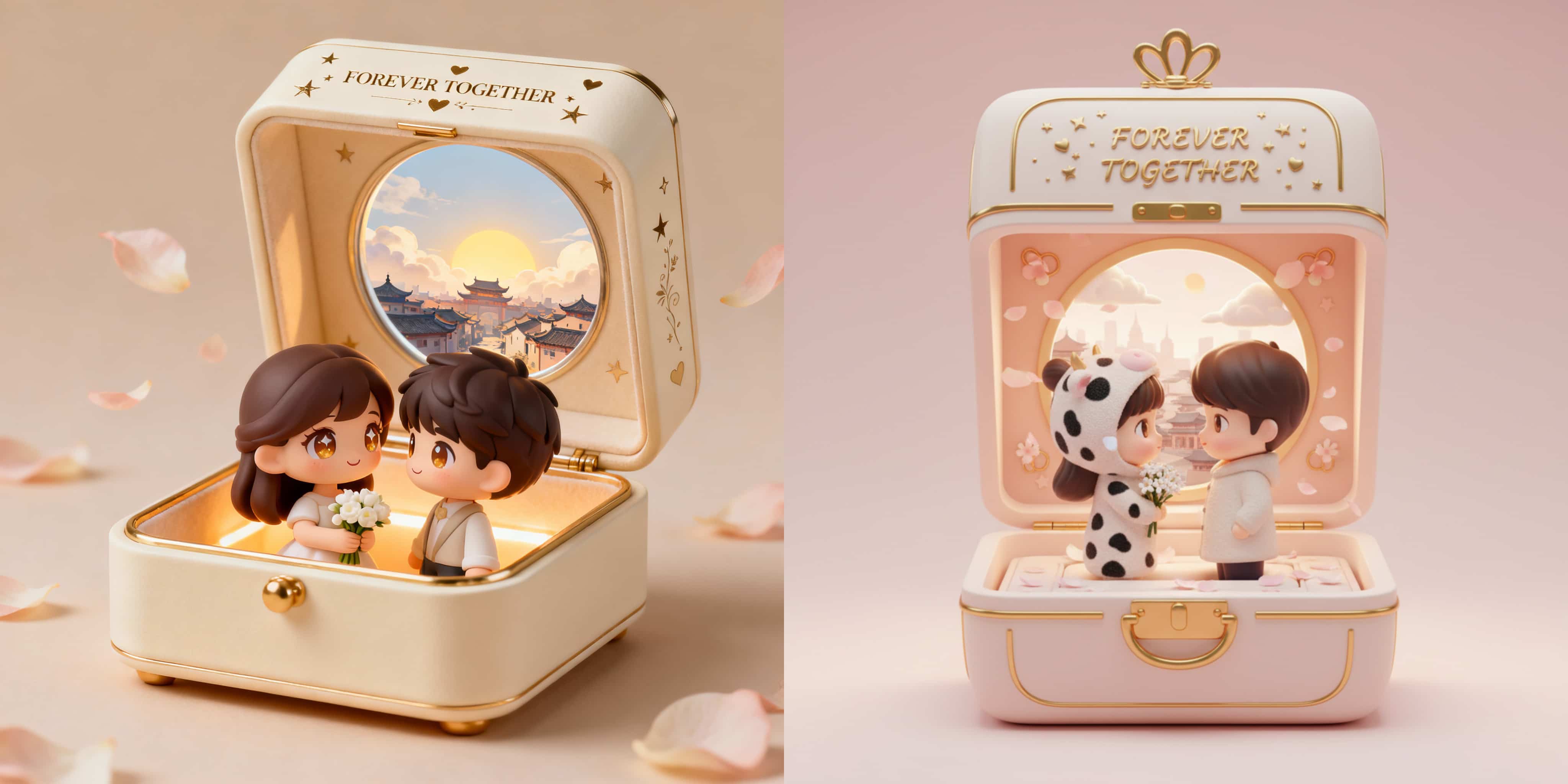
This comparative study explores how seeDream 4.0 and Nano Banana interpret a romantic 3D collectible prompt that blends miniature craftsmanship, emotional storytelling, and luxury design sensibility. The goal is to produce a heartwarming diorama—a jewelry box that opens to reveal two chibi-style lovers rendered in a soft, pastel-toned environment. Both systems are tested for their ability to balance realism, sentimentality, and material detail while maintaining visual harmony within the confined space of a jewelry box.
By Nathan 一 Oct 07, 2025- Nano Banana
- Seedream 4.0
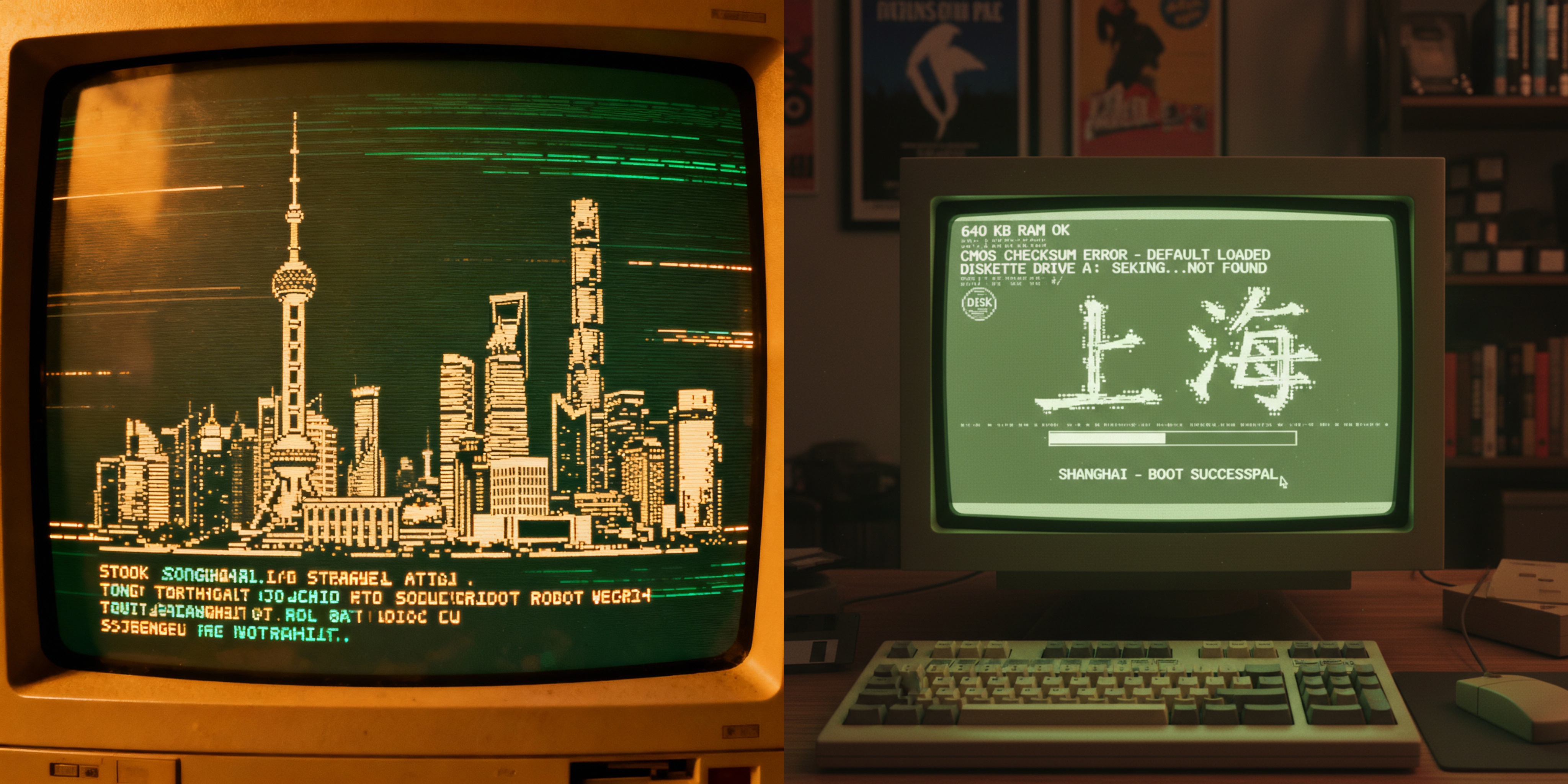
Shanghai in ASCII: Retro CRT Boot Screen Art
This blog explores how two cutting-edge AI models, Seedream 4.0 and Nano Banana, interpret the same creative prompt: “Retro CRT computer boot screen that resolves into ASCII-art of Shanghai skyline.” By comparing their outputs, we uncover the unique strengths of each model in capturing retro aesthetics, balancing realism with stylization, and communicating cultural identity through ASCII art.
By Nathan 一 Oct 07, 2025- Nano Banana
- Seedream 4.0
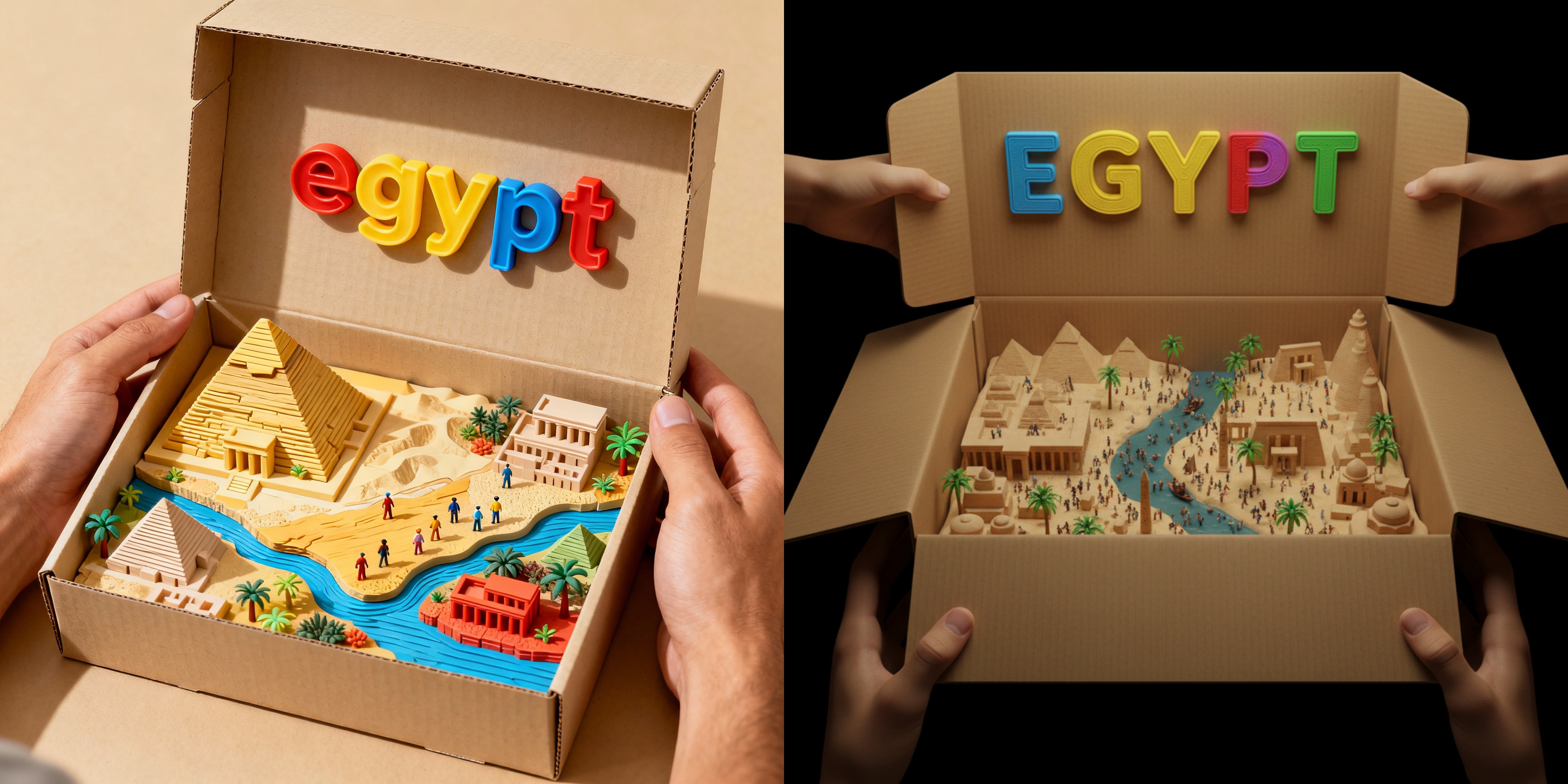
Toy Box Dioramas: Comparing SeeDream 4.0 and Nano Banana on Egypt
This article examines how SeeDream 4.0 and Nano Banana interpret the diorama-in-a-box prompt. The task requires balancing geographic accuracy, toy-like craftsmanship, and visual storytelling while maintaining the illusion of a 3D-printed tactile model. The inclusion of iconic landmarks, miniature figures, and colorful typography makes this task particularly challenging in terms of detail density and scene harmony.
By Nathan 一 Oct 07, 2025- Nano Banana
- Seedream 4.0
- X
- Youtube
- Discord
